2026-07-22
Throw Pillow Mockups That Make Listings Feel Real
Create listing images that show your artwork at home. Learn how throw pillow mockups improve Etsy and POD conversion, seasonal launches, and speed fast.
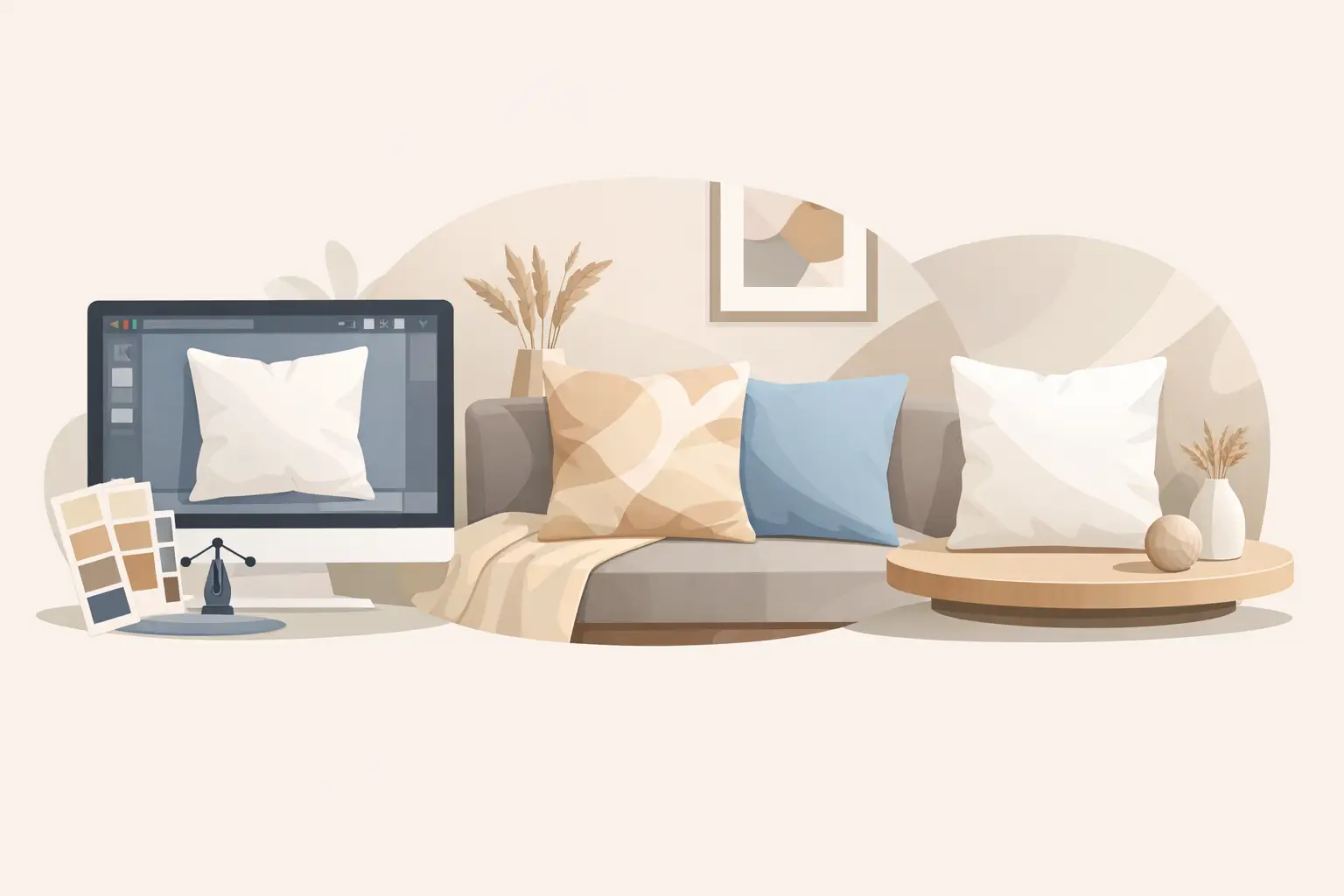
A square pillow design can look finished on your screen and still feel unfinished to a shopper. Flat artwork does not show scale, texture, or the mood a buyer is bringing into their home. Throw pillow mockups close that gap by placing your design on a believable product in a styled space, before you order a sample or plan a photo shoot.
For Etsy and print-on-demand sellers, that is more than a visual upgrade. It is a faster way to build listing images that help shoppers picture the product on a sofa, accent chair, bed, bench, or front porch. The right mockup makes a simple design feel like a finished home item someone can give, personalize, or add to their seasonal decor.
Why Pillow Listing Images Need More Than a Flat Design
Shoppers rarely buy a throw pillow because they love a PNG file. They buy it because they can imagine the design in their own room, paired with their own furniture and routines. A lifestyle image supplies the context that a plain product preview cannot.
That context answers quiet but important questions: Does the design read clearly from a normal viewing distance? Does the color work with neutral furniture? Does the pillow look cozy, polished, playful, or giftable? A photorealistic scene makes those answers easier to absorb in a second or two, which matters when shoppers are scanning search results on a phone.
This is especially useful for personalized pillows. A family name, pet illustration, wedding date, or holiday message often looks more valuable once it appears on a styled cushion rather than a blank digital canvas. The customer is no longer evaluating typography alone. They are evaluating a finished gift.
A mockup cannot replace a truthful product description, accurate dimensions, or clear production details. It can, however, do the visual merchandising work that helps the right customer stop scrolling long enough to read them.
What Makes Throw Pillow Mockups Believable
Not every template creates the same result. A pillow scene needs to preserve the small visual details that make fabric products convincing: soft seams, natural wrinkles, realistic shadows, and the slight changes in color created by light falling across the material.
The artwork also needs to follow the pillow's shape. On a high-quality PSD mockup, a smart object applies your design while perspective, folds, and lighting remain intact. Instead of manually warping a graphic and trying to recreate fabric texture, you replace the placeholder art and let the file do the production work.
Canva-compatible PNG options serve a different workflow. They are useful when you need a lower-friction setup, a quick promotional image, or a simple way to layer art into a prepared visual. The trade-off is flexibility. Photoshop smart objects generally provide the most refined placement and fabric realism, while Canva files can be a practical choice for sellers who do not use Photoshop or need a fast social post.
Scene selection matters just as much as file format. A pillow photographed on a bright modern sofa tells a different story than one staged beside a fireplace, on a rustic bench, or in a holiday living room. Neither is automatically better. The best setting is the one that supports your design and the buyer you want to reach.
Choose the Scene Before You Place the Artwork
Start with the product's purpose. If you sell minimalist monogram pillows, clean interiors with soft daylight keep the focus on the personalization. If you sell autumn sayings or farmhouse-inspired art, warm textures, wood accents, and seasonal styling can make the listing feel immediately relevant.
For Christmas, winter, Halloween, and fall collections, seasonal scenes can help shoppers understand where the item belongs. They also create urgency without adding aggressive sales language. A pillow placed on a decorated couch or entryway bench gives a seasonal design a clear use case: it is ready to become part of the home before guests arrive.
Still, avoid choosing a scene just because it is visually busy. A detailed design can disappear against patterned blankets, bold wall art, or heavy decor. When your pillow artwork has small text, fine line art, or a subtle neutral palette, use an image with enough visual breathing room around the product.
It helps to build a small scene mix for every collection. Use one primary lifestyle image that makes the design feel at home, one closer image where shoppers can see the artwork clearly, and one alternate setting for variety in your listing gallery or social posts. You do not need ten nearly identical images. You need a few images that each have a distinct job.
A Fast Workflow for Production-Ready Images
The goal is not to spend an afternoon perfecting a single listing image. It is to create a repeatable system you can use for every new design.
1. Prepare artwork at the right size
Before opening the template, make sure your design is high resolution and built for the pillow's printable area. Keep important text and graphics away from the edges. A phrase that looks centered on a flat square may feel too close to a seam once it is placed on a stuffed pillow.
Check your spelling, personalization fields, and color choices before adding the design to several scenes. One corrected source file is much easier to manage than revising five exported mockups later.
2. Replace the smart object or add the PNG
In Photoshop, open the smart object layer, paste or place your artwork, save the smart object, and return to the main file. The mockup should retain the scene's fabric, light, and perspective so the art looks printed rather than pasted on top.
For a Canva workflow, add the supplied mockup elements to your design, position the artwork carefully, and use the provided guides or layout approach. Review the result at full size, not only as a tiny editor preview. Small alignment problems become obvious when a customer zooms in.
3. Export for the channel, not just the file folder
Your Etsy listing image, Shopify product gallery, Pinterest pin, and Instagram post may need different crops. Start with a clean, high-resolution master export, then create channel-specific versions. Keep the pillow visible early in the frame so the product does not get lost when an image is cropped on mobile.
Use clear file names such as `winter-pine-pillow-sofa-main` or `custom-pet-pillow-neutral-bedroom`. This sounds basic, but organized exports save real time when you are updating a listing, testing a new thumbnail, or relaunching a seasonal bestseller next year.
4. Keep the listing visually consistent
If one product uses a warm cottage interior and the next uses a stark studio scene, your shop can start to feel accidental. Consistency does not mean every listing must use the same room. It means the lighting, color direction, styling level, and overall customer experience should feel connected.
MockupSmith's square pillow templates are useful here because they give sellers a focused set of lifestyle scenes without requiring each new design to begin with a new photo shoot. You can maintain a recognizable visual standard while still showing enough variety to make seasonal collections feel fresh.
Common Mistakes That Make a Mockup Feel Less Credible
The most common issue is artwork that is too large for the pillow. A design may technically fit, but oversized text and edge-to-edge graphics can look distorted or crowded once fabric folds are visible. Give the design a little margin unless the intended print style truly calls for a full-bleed look.
Another problem is using a scene that conflicts with the design. A delicate nursery illustration can feel out of place in a dark, heavily styled holiday room. Likewise, a bold Christmas graphic may not get enough attention in a pale spring interior. Match the environment to the collection's mood, but let the product remain the hero.
Be careful with color expectations, too. Mockups communicate a visual impression, not a guarantee of exact printed color across every device and production process. If shade accuracy is central to the purchase, use clear descriptions and consider including close-up product details alongside lifestyle imagery.
Finally, do not use mockups to imply features the actual item does not have. If your product is a cover only, state that clearly. If the insert, zipper, fabric type, or print method varies by production partner, describe it accurately. Great listing imagery builds attention; accurate information builds trust.
Use Mockups to Test What Shoppers Notice First
Once you have several scenes, test which image works best as the lead photo. The prettiest image is not always the strongest thumbnail. On a search page, a brighter scene, a closer crop, or a pillow with stronger contrast may earn more clicks.
Try changing one variable at a time. Test a close sofa scene against a wider room view, or compare a neutral background with a more seasonal setting. Watch for practical signals: clicks, favorites, add-to-carts, and sales. Results can vary by niche. Personalized gift buyers may respond to a clear close-up, while home decor shoppers may be more persuaded by a complete room moment.
Keep the winning images as part of your reusable system, then refresh the supporting visuals when a season changes or a collection expands. That gives your shop a polished look without turning every product launch into a photography project.
Your design deserves to be seen as the product it will become, not just the file it started as. Choose scenes that make the buyer's next step easy to picture, then spend the saved time creating the next listing worth clicking.